
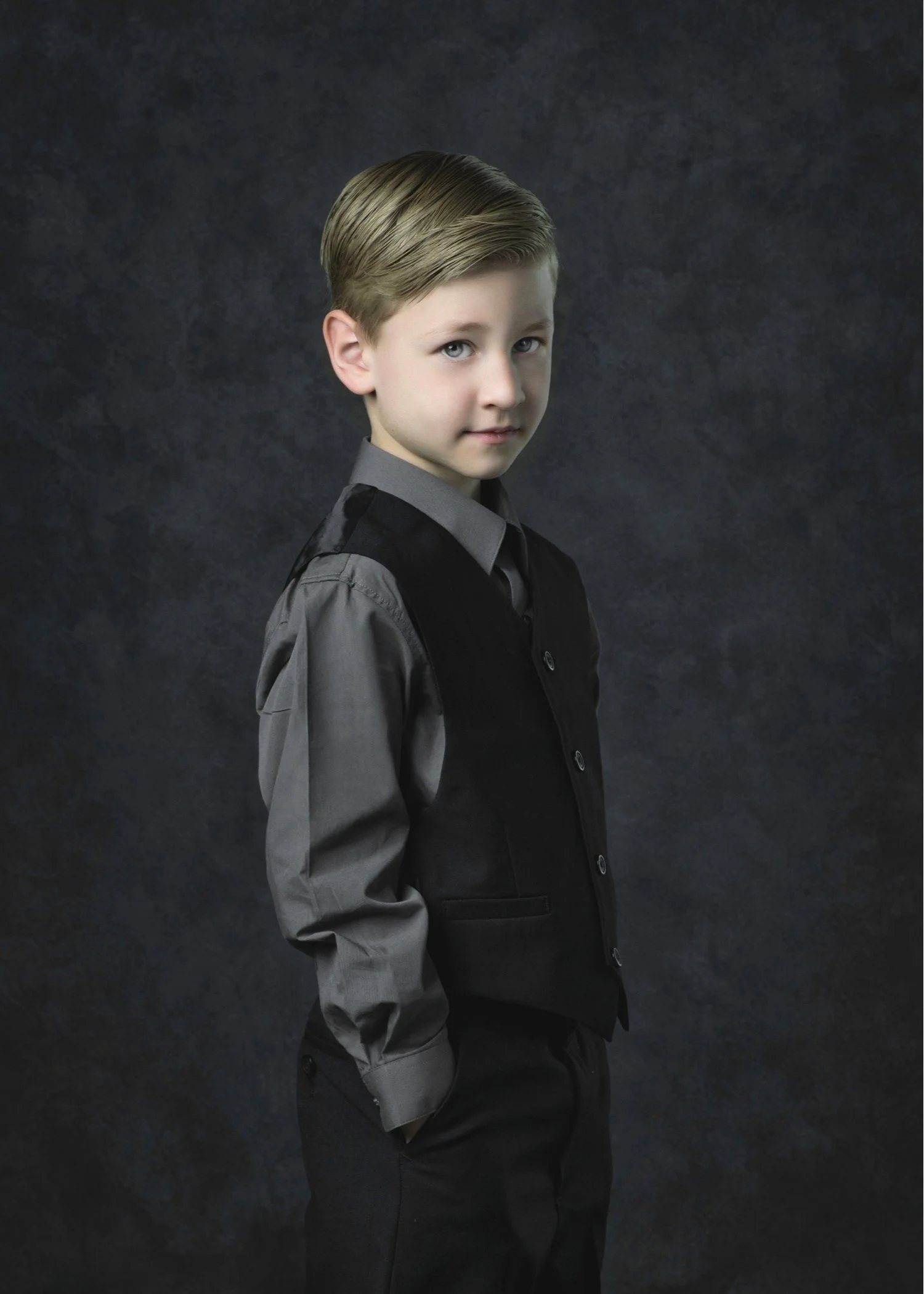
Baroque
Choosing the Baroque Palette determines many other aspects of your portrait plus specific technical applications such as the lighting.
Lighting creates strong highlights and deep, heavy shadows, emphasizing the faces and hands of the subject and using the principle of chiaroscuro.
Expressions are thoughtful,penetrating and pensive.
There is great depth in these portraits as the subject‘s clothing melds into the background, creating a strong center of interest around the faces.
The [3] Walden Color Palettes
Understanding the power of color.
Tim describes the [3] color palettes in this 11-minute video.
[3] Palette Options
Monochromatic
The Monochromatic Palette consists of a group of colors that are closely related in intensity and tone without one standing out from the others.
We think of this palette in two groups; the Light-tone Options and the Mid-tone Options.
The lack of vastly contrasting colors in the same portrait leads viewers straight to the subject of the portrait with its ultra simple approach.
Whether the portrait focuses on mid-tones or light tones, this palette is a favorite for all subjects, from children to adults.
Classic
The Classic Palette often includes bold colors, and in group portraits, are beautiful when used with neutrals.
When you choose this palette, we then determine many other aspects of your portrait, including specific background selections from our artisan, hand-painted collection.
We carefully select the lighting that best fits in order to bring out the best features of each subject.
Expressions are thoughtful and pleasant.